Client Overview
Iceberg IoT creates software that helps factory operations managers make data-informed decisions.
Iceberg IoT is compiling raw data from across the factory floor, inputting it into a machine learning algorithm, and producing valuable insights for manufacturers.
Problem
In order for a client to make data-informed decisions, Iceberg IoT is in need of a front-facing client dashboard that will visualize the data they are able to collect.
Project Timeline
Starting with the project scope and delivering the final materials to the client, this project was completed within a 3-week timeframe.
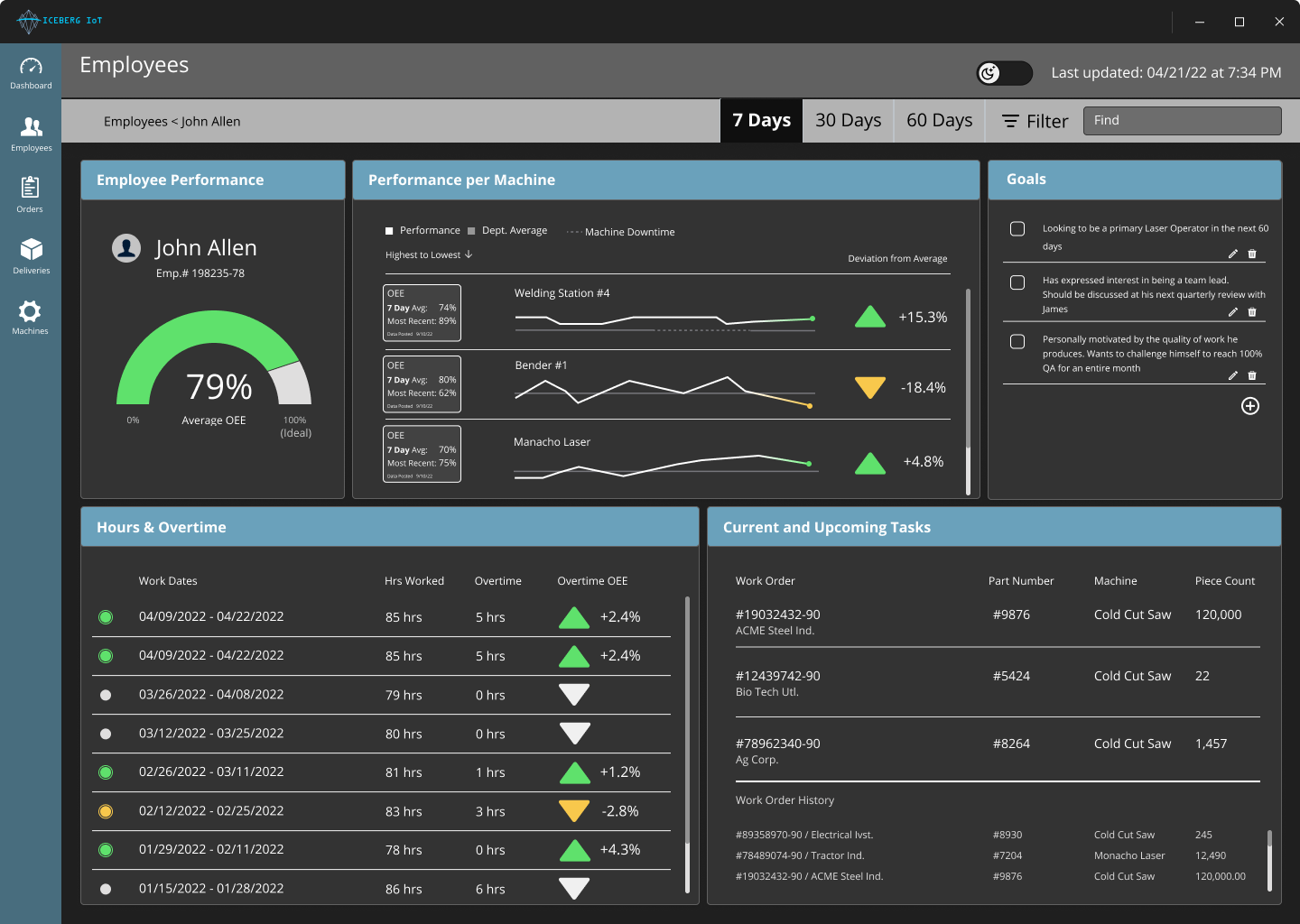
Proposed dashboard solution at a work station on a metal distributors factory floor.
Design Team

As a team we developed the Iceberg IoT data intelligence dashboard.

Visual created for the final presentation to help explain the concept of “Internet of Things” and what our role was for this project.
My Role:
Although the project was a group effort I did focus on a handful of key components from the project scope.
Moderated a usability test session of our initial prototype.
Designed and provided quality control on our final dashboard prototype.
Laid out our final presentation deck with images and informational graphics.
Participated in a live presentation of the final presentation to our client Iceberg IoT and Prime Digital Academy community.
Final client meeting to deliver the project assets to the client.
Secondary research of dashboard systems.
Moderating and note-taking of Primary Research interview sessions.
Developed an on-site design workshop with a Metal Manufacturing Facility.
Synthesized research findings into key project insights.
Sketched wireframe concepts of the dashboard.
Created information architecture workflows for a use case scenario.
Built the initial wireframe prototype for our dashboard design. Would be used as the template for the final prototype.
Research Findings & Methodology
This project required multiple Miro boards to stay on track. To stay on track with all of this information we needed to have a consistent way to visually communicate the problem.
The world of manufacturing was thick with industry jargon and technical specifications. To gain a foothold in this world and define our problem space, we began with secondary research which included competitive analysis of Amazon Quicksight, Microsoft Azure, and ERP Systems.

Design Strategy
Secondary Research
We took away a core insight: users don’t pull up a dashboard simply to view insights. Users pull up a dashboard to answer questions they have so that they can make decisions based on those answers.
Contextual Inquiry
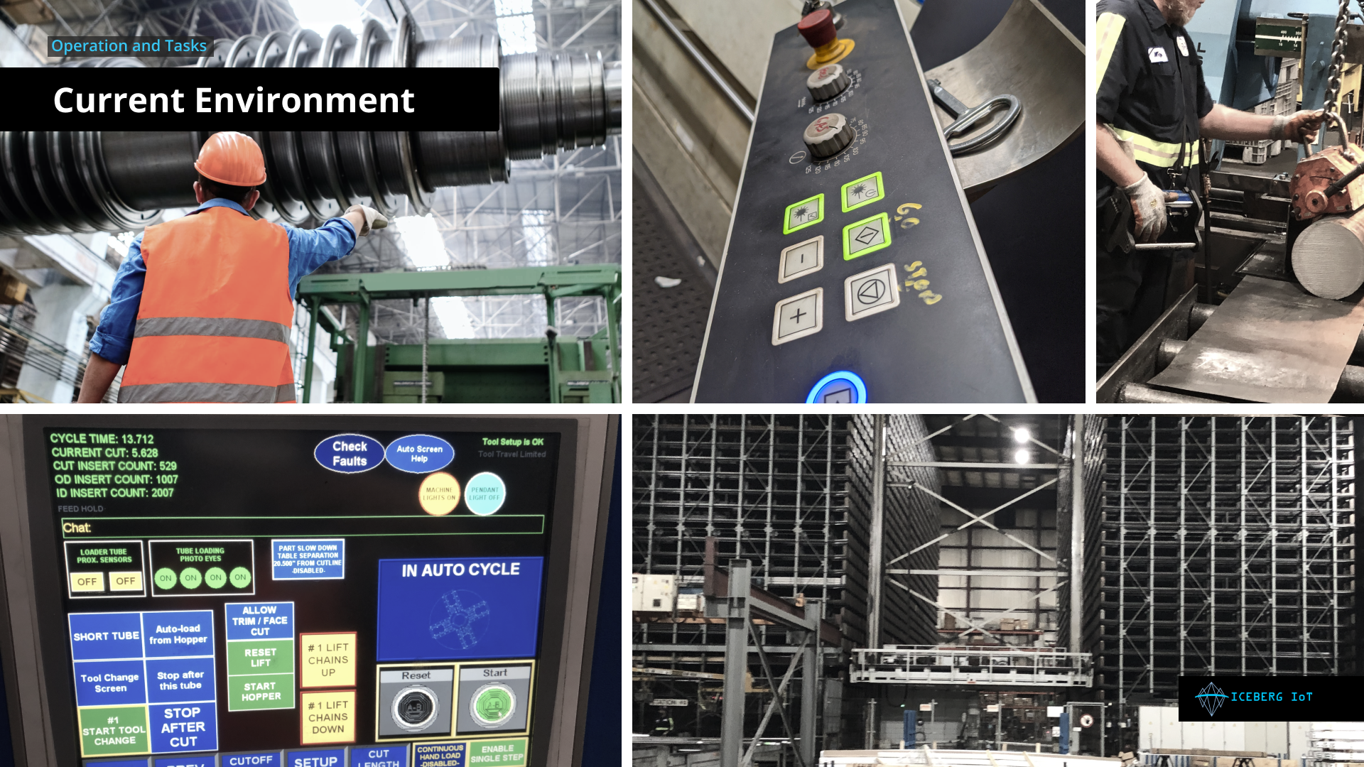
Conducted interviews with factory managers and observed the operations of two metal manufacturers, one in St. Cloud and another in Kansas City. The managers described hectic workdays spent juggling phone calls, work orders, and employees to ensure that customers get the material they need.
Design Workshop
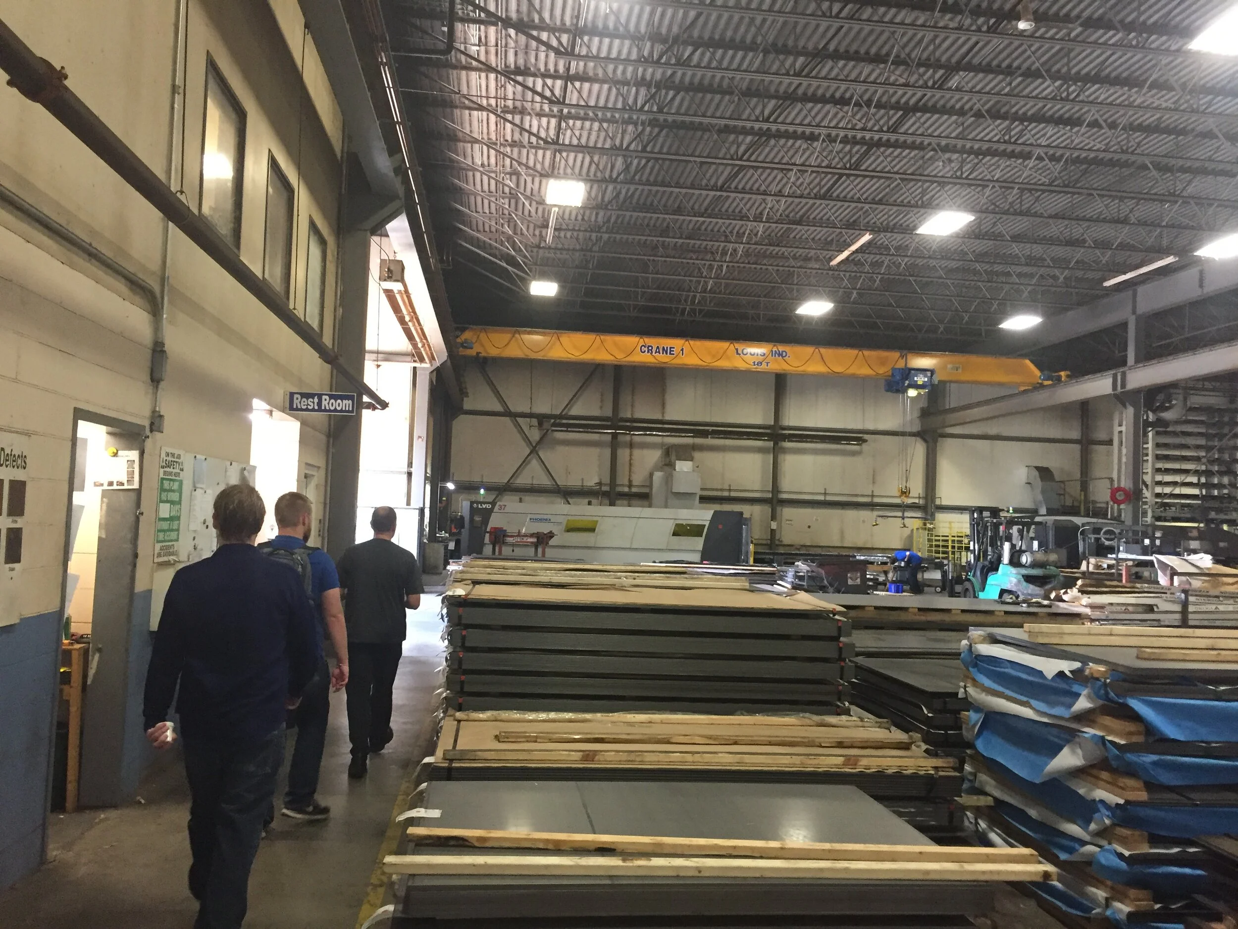
Tasha and I visited the metal manufacturing facility of Louis Industries in Saint Cloud, MN. We were able to get a site tour of the factory floor and conducted a design workshop. The focus of the workshop was to ask them what are the top-5 things they wish they knew about the shop floor. We brought those insights back to the team to start building wireframes.

Wireframes
Created the wireframe template for our prototype. Focused on the navigation structure, the spacing between cards, and the visual hierarchy of each cards.
Usability Testing
Developed a usability plan and conducted sessions with 4 different user groups. Each participant was asked to complete a set of tasks to view the dashboard. They provided feedback on the initial design ideas and data visualizations.
Interactive Prototype
The final prototype was developed using Figma and connected together for an interactive presentation. The team developed a “dark-mode” of the project as well to show a secondary option to help reduce eye strain for the factory workers.
Wireframe Sketches


Dashboard Layouts


Final Presentation & Interactive Prototype
As the project was coming to the end we were asked to present our project to the client and Prime Digital Academy community.
Interactive Prototype created in Figma. Narration provided by Matt Mahr.


Landing Page Concept
The project included a stretch goal of also creating a new landing page for Iceberg IoT.
With a better understanding of the project space and the market, I helped mock up this initial landing page concept. We incorporated visuals of the dashboard, a simple input request for a demo presentation, and manufacturing imagery.

Current Landing Page
Proposed Landing Page Concept
Lessons Learned
This project was a wonderful exposure to the world of dashboard design. The space is deep and there are a lot of nuanced systems that a manufacturing facility could use to track operational performance. I personally had to learn a lot about what all this technology could do before really diving into a visual for the dashboard. Wrapping my head around the project was not only engaging but truly rewarding. By understanding the problems a company is currently facing and understanding data visualizations, we were able to create a strong first prototype.
As far as the next steps, I would recommend that Iceberg IoT continue to develop the concept as they move forward with their business plans. An operations manager will be able to provide a lot of insight once the data is connected to a functioning dashboard.